Step 4 - advanced map styling
Click here to download the complete files for all steps in this tutorial.
You can show more information in the map simply by adding it to the show map component’s data adapter. Go back to the show map script editor window. If you closed this editor window and you saved the script to disk, you can open it again by:
- Ensuring the current scripts directory is the directory where you saved the script.
- The script should be visible in the scripts list. Open it by doing one of the following actions:
- Double click on the script's name.
- Select the script, right-click on it and then select edit script from the pop-up menu.
- Select the script and then press the edit selected script button in the script toolbar directly below the scripts list.
In the data adapter table find the row which has label under the Name column. Click on this row’s entry under the Source column and a drop-down menu should appear as shown in the following screenshot:
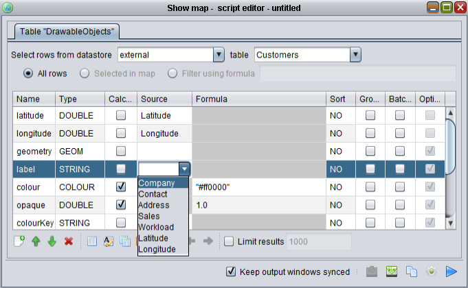
Select the field Company from the Customers table as the Source and then press the blue arrow on the bottom right of the dialog to re-play the script. You should now see company names in the show map control:
You can do more advanced map styling by customising the adapter – for example, instead of specifying a source column you can use a formula instead. Configure the show map adapter as follows:
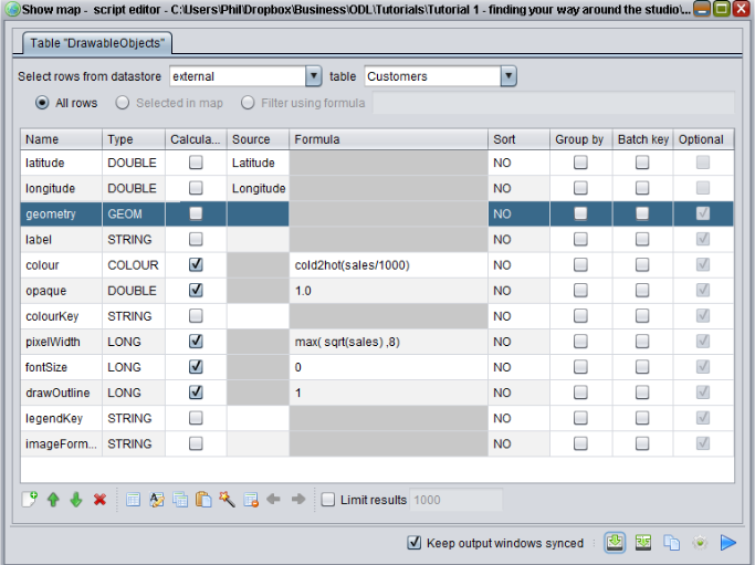
Here we have:
- Disabled showing Company name by clearing the Source cell in the label row.
- Checked the calculated box in the Colour row to indicate we want to use a formula to calculate colour and then entered the formula
cold2hot(sales/1000).- Cold2Hot returns a colour from blue to red depending on the value of the input number – in this case based on sales to a customer. The higher the sales, the more red the customer point will appear.
- Entered the formula
max(sqrt(sales),8)for the width of the customer point. This will make the customer point larger if the customer has more sales.
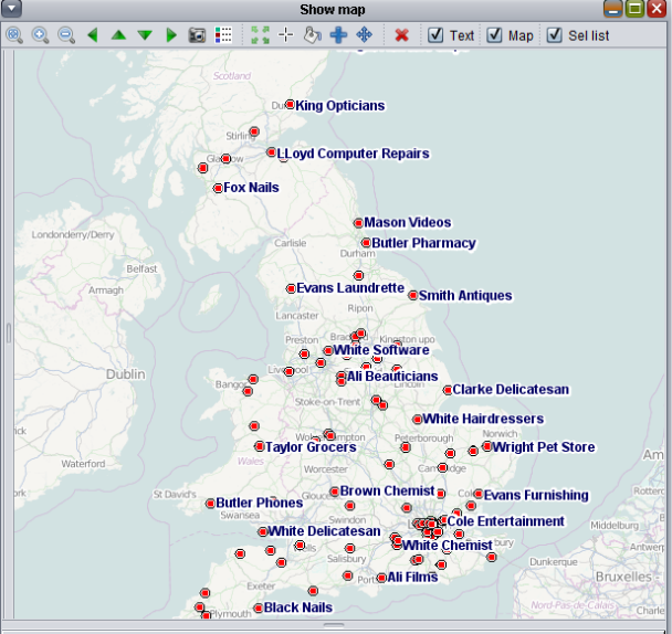
Change your show map adapter to match the screenshot and press the play button to run the script. You should see a map similar to:
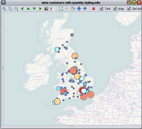
You can then easily visualise where your most important customers are.
Tip – you can view the list of all available functions to use in formulae by selecting the list functions option under the Help menu.
The different scripts you developed to show the customers will work with any Excel spreadsheet file in the table format with the expected sheet names and columns names. To show your own customers on a map you need an Excel spreadsheet with a Customers sheet and this sheet must have columns named Latitude and Longitude, filled with latitude and longitude data. Similarly to show the company’s name using the script you developed your worksheet just needs a Company column and to show the map coloured according to sales you just need a Sales column. Alternatively instead of changing column names in your own Excel spreadsheet you can just change the scripts to expect different column names.
Now try reproducing the earlier steps on your own customer data.
Tip – the ordering of columns in your sheet does not matter. It also doesn’t matter if you have extra columns not used by ODL Studio.
Tip – ODL Studio is not case-sensitive - your Customers table could be called CUSTOMERS, customers or CuStOmErS and the studio would not care. Spaces before and after a name are also ignored.
Remember although configuring the map to display your customers as you want may seem a bit complex, you only need to configure it once and then you just replay your saved script every time after that. Contact us if you’d like help with configuring the ODL Studio for your data.